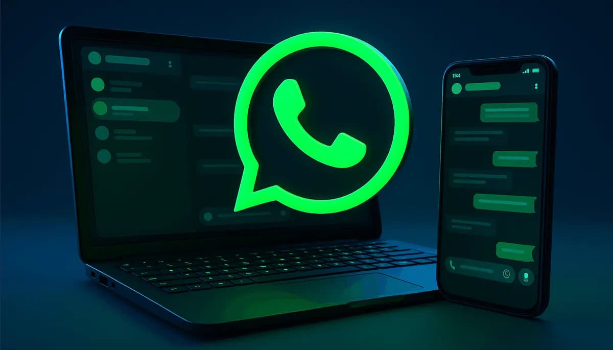
WhatsApp's 'Liquid Glass' Design: A Deep Dive into the Messaging Giant's Visual Evolution
WhatsApp is reportedly testing a significant visual overhaul, dubbed 'Liquid Glass,' featuring a floating chat bar and a more modern interface. This design shift, heavily influenced by recent iOS trends, aims to refresh the app's aesthetic and user experience. While the rollout remains slow, this article explores the implications of such a change for the world's most popular messaging platform and its vast user base.
In the ever-evolving landscape of digital communication, even the most ubiquitous platforms must continuously adapt to stay relevant and engaging. WhatsApp, the messaging behemoth with over two billion users worldwide, appears to be on the cusp of a significant visual transformation. Whispers and early sightings suggest a new design language, tentatively dubbed 'Liquid Glass,' is in the works, promising a sleeker, more modern aesthetic heavily inspired by the latest iOS trends. This isn't just a superficial coat of paint; it represents a strategic move to refine the user experience and keep pace with contemporary design paradigms.
The Dawn of 'Liquid Glass': What We Know So Far
The 'Liquid Glass' moniker, while unofficial, aptly describes the perceived direction of WhatsApp's visual refresh. Reports from beta testers and tech observers point to a series of subtle yet impactful changes designed to create a more fluid and intuitive interface. Key among these is the introduction of a floating chat bar, a departure from the current fixed input field. This element, often seen in modern UI/UX designs, aims to provide a cleaner look and potentially better screen real estate utilization, especially on larger displays. Accompanying this is an overall updated interface, characterized by softer edges, more pronounced use of white space, and potentially new iconography that aligns with Apple's recent design philosophies, particularly those seen in iOS 16 and 17.
Historically, WhatsApp has maintained a relatively consistent, albeit functional, design. Its strength has always been its reliability and simplicity. However, in an age where visual appeal and seamless interaction are paramount, even the most functional apps must evolve. The proposed changes suggest a move towards a more premium feel, potentially elevating the app from its utilitarian roots. The rollout, as expected for such a massive platform, is slow and incremental, reaching only a select group of beta users. This cautious approach allows the company to gather crucial feedback and iron out any kinks before a broader release, minimizing disruption for its vast and diverse user base.
iOS Influence: A Design Paradigm Shift for WhatsApp?
It's no secret that Apple's iOS ecosystem often sets benchmarks for mobile user interface design. Its emphasis on clarity, depth, and intuitive gestures has influenced countless applications. WhatsApp's apparent adoption of 'Liquid Glass' elements strongly indicates a conscious effort to align with these prevailing trends. The translucent effects, subtle animations, and rounded corners that define modern iOS aesthetics are likely to be integrated, providing a more visually appealing and cohesive experience for iPhone users, and potentially influencing the Android version as well.
This isn't the first time an app has looked to a dominant mobile OS for design inspiration. Many cross-platform applications strive for a native feel on both iOS and Android, often by adopting elements from each platform's design guidelines. For WhatsApp, a platform that has traditionally prioritized functionality over groundbreaking aesthetics, this shift is particularly noteworthy. It suggests a recognition that design is no longer just about usability; it's about creating an emotional connection and a sense of modernity. The challenge, of course, will be to implement these changes without alienating its massive Android user base, who might prefer a more Material Design-centric approach.
The User Experience: Beyond Aesthetics
While visual refreshes often grab headlines, the true test of any design update lies in its impact on user experience. A floating chat bar, for instance, isn't just about looking good; it can free up screen space, making conversations feel less cramped. The updated interface, with its potentially improved visual hierarchy, could make it easier to navigate through settings, find specific chats, or utilize new features. For a platform used by billions for everything from casual chats to critical business communications, even minor improvements in usability can have a profound effect.
Consider the sheer volume of daily interactions on WhatsApp. According to Statista, over 100 billion messages are sent daily across the platform. In such a high-volume environment, efficiency and ease of use are paramount. A design that reduces cognitive load, improves readability, and streamlines interaction flows can significantly enhance user satisfaction. However, change also brings the risk of friction. Users, especially those accustomed to the app's long-standing interface, might initially resist new layouts or interaction patterns. WhatsApp's gradual rollout strategy is a clear acknowledgment of this, allowing for iterative adjustments based on real-world usage data.
The Competitive Landscape and Future Implications
WhatsApp operates in a fiercely competitive market, constantly vying for user attention against rivals like Telegram, Signal, and even native messaging apps. While its sheer scale gives it a significant advantage, maintaining its lead requires continuous innovation, not just in features but also in presentation. Telegram, for example, has long been praised for its sleek design and rich feature set, often pushing the boundaries of what a messaging app can do visually. By embracing a more modern aesthetic, WhatsApp aims to close this perceived gap and reinforce its position as a contemporary communication tool.
Looking ahead, this design evolution could be a precursor to more significant changes. A refined interface often paves the way for the integration of new features, whether they are advanced payment options, enhanced community tools, or deeper integration with the broader Meta ecosystem. A modern design signals to users that the platform is actively being developed and is committed to offering a cutting-edge experience. Furthermore, for businesses leveraging WhatsApp Business, a more polished and professional interface could enhance their brand image and customer interactions.
Conclusion: A Measured Step Towards Modernity
WhatsApp's exploration of a 'Liquid Glass' design represents a measured yet significant step towards modernizing its user interface. While official confirmation remains elusive, the consistent reports and visual cues from beta versions paint a clear picture of a platform striving for a more refined, aesthetically pleasing, and intuitive user experience. This move, heavily influenced by iOS design trends, underscores the importance of visual appeal in today's digital landscape, even for a juggernaut like WhatsApp.
The challenge for WhatsApp will be to implement these changes seamlessly, ensuring that the visual refresh enhances rather than disrupts the core functionality that billions rely on daily. As the rollout slowly progresses, the tech world will be watching to see if this 'Liquid Glass' transformation truly elevates WhatsApp's standing, solidifying its position not just as a functional necessity, but as a visually compelling and modern communication hub for the next generation of users. The future of messaging, it seems, will not only be about what you say but also about how beautifully you say it.
Stay Informed
Get the world's most important stories delivered to your inbox.
No spam, unsubscribe anytime.
Comments
No comments yet. Be the first to share your thoughts!